
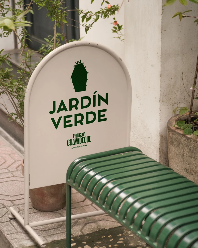
Every brand knows the decay: the logo a supplier stretches, the orange that prints differently at every shop, the typeface someone swapped "because they didn't have it installed", the friendly Instagram tone coexisting with the stiff corporate voice of the proposals. None of those decisions were bad faith — they were the absence of a manual. The brand book exists so the brand survives daily life and every pair of hands it passes through.
What it is (and isn't)
A brand book is the document that fixes how the brand expresses itself: what's untouchable, what's flexible and how to decide in the cases the manual didn't foresee. It's not a ceremonial PDF to show once — it's a working tool used by designers, printers, community managers, developers and any supplier who touches the brand.
What it must include
1. Strategic foundations
Positioning, values, personality and brand territory, on one page anyone can understand. It's the part most often skipped and the one that gives judgement for everything else: without it, the manual is a list of rules with no why.
2. Logo and system
Versions (primary, secondary, symbol), clear space, minimum sizes, use over backgrounds and photography — and just as important: the incorrect uses, with examples. Whatever isn't explicitly forbidden, someone will do.
3. Colour and typography
The palette with codes for every medium (Pantone, CMYK, RGB, HEX), colour hierarchies, and the type families with weights, uses and system fallbacks for when the brand font isn't available (emails, presentations).
4. Visual style
Photography (light, framing, what's shown and what isn't), illustration and iconography, textures and graphic devices. It's what makes a piece recognisable before you see the logo — and what a new supplier appreciates most.
5. Tone of voice
How the brand speaks and how it doesn't: register, house expressions, banned words, before/after examples. With the volume of copy produced today (websites, social, email, AI in the mix), a codified voice is the difference between a brand and a letterhead.
6. Real applications
The brand applied where it will live: website, social media, stationery, signage, packaging, uniforms, presentations. Every solved application is one less doubt and one less drift.
The right size
A 90-page manual nobody opens protects less than a 25-page one the whole team knows. The practical rule: exhaustive on the untouchable (logo, colour, type), indicative on the flexible, and real examples throughout. And alive: as the brand grows — new channels, new products — the manual grows with it.
At staycreative every branding project ships with its manual: we don't consider a brand finished if it can't defend itself on its own. If yours is deforming for lack of rules, let's talk.